Warner brothers just dropped the official trailers (#1 - #4) for Blade Runner 2049 and it looks beautiful. Director Denis Villenueve is back with frequent collaborator, Roger Deakins (Cinematographer) for the second installment of the series. Surprisingly the film has taken a unexpected departure from its predecessor. Going from a grungy cyberpunk vibe to a cleaner aesthetic; in all honesty it does take place 20 years into the future of the original movie - hence why the change? Thats another topic for another time. We're here to look at Villeneuve techniques and style, plus Deakins' cinematography. Shot on the ARRI ALEX XT STUDIO accompanied by ZEISS MASTER PRIME lenses. Since the film is not out yet I'll be looking at grabs from the official trailer #1 and #4 (2 and 3 are pretty much the same) and breaking down some techniques, composition, lighting and anything interesting that comes to mind (albeit lightly). In advance forgive my ramblings : )
Composition study
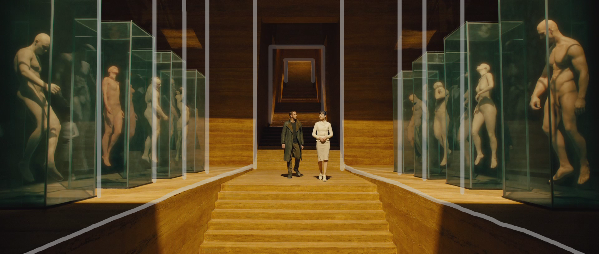
Symmetry symmetry symmetry. Lots and lots of it. A lot the 'Formal' scenes utilise symmetry in conventional and unconventional ways. Looking at the grab below: we see it being emphasised with the method of repeated shapes and structures throughout the scene. This lend to the typical trop / theme of order / formality / corporate. Production designer Dennis Gasner's superb job in designing the sets really shines through in these scenes. Simple but at the same time engaging.
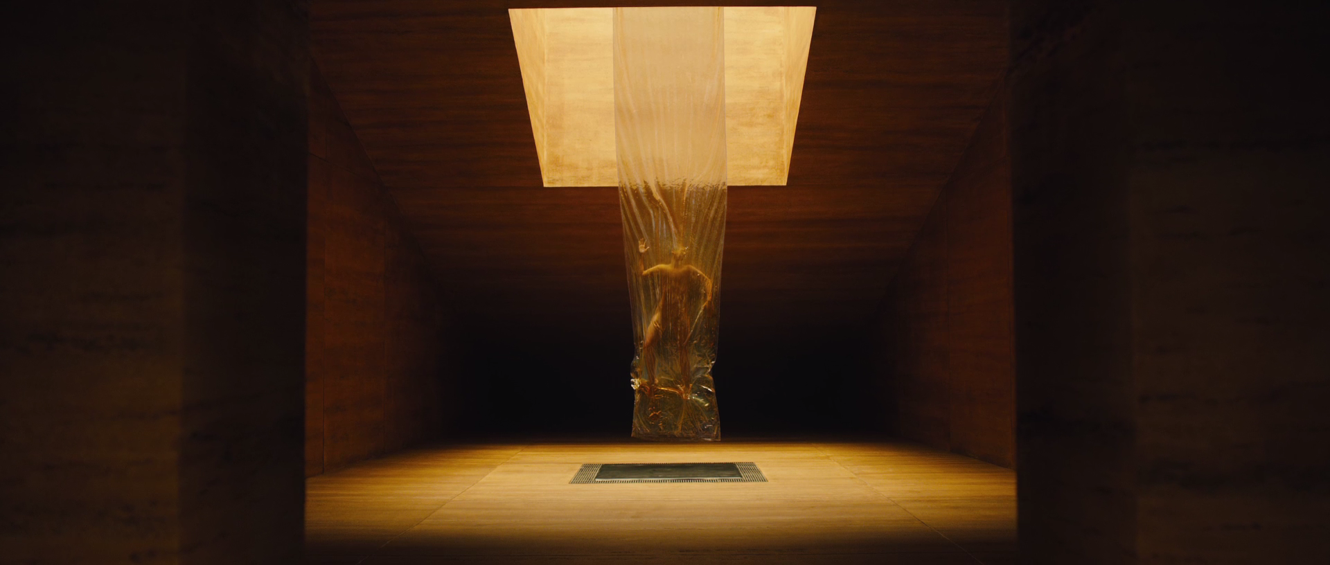
Looks like Deakins has gone for a large and soft source (which we'll discuss later) with light coming in from one direction at times. What catches my attention is that the light is being bounced of the surrounding environment to create this gradual spill with a very soft fall off, that leaves some areas in darkness. It rings of "clean" but "unknown" which resonates very well with the "replicant facility" (assumption!)
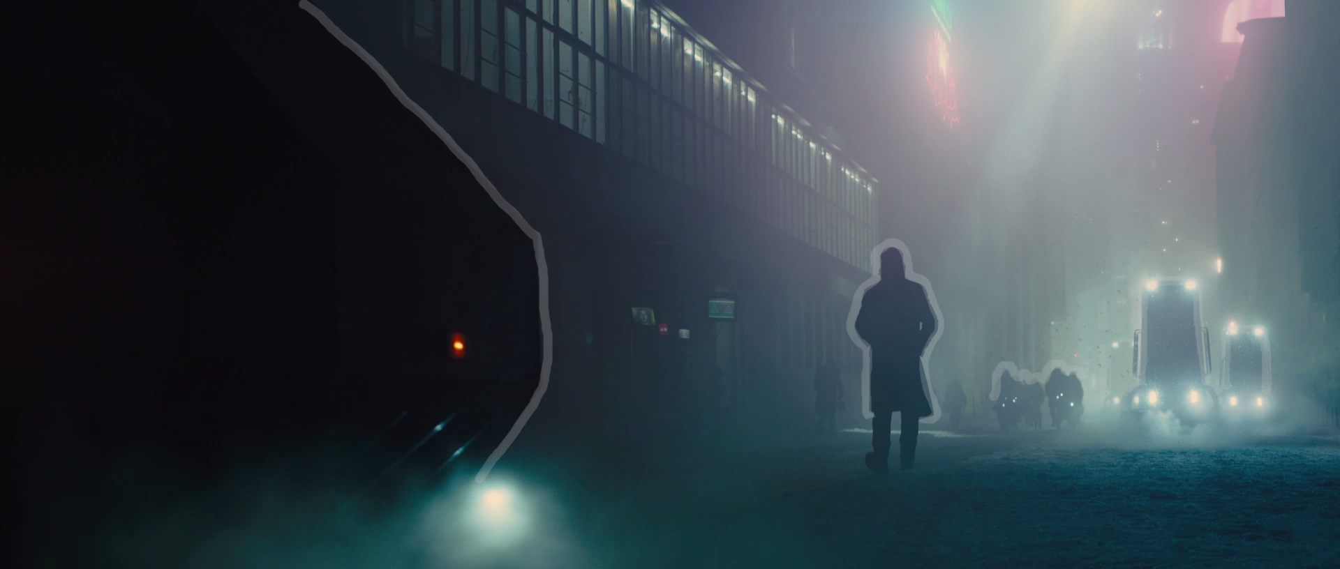
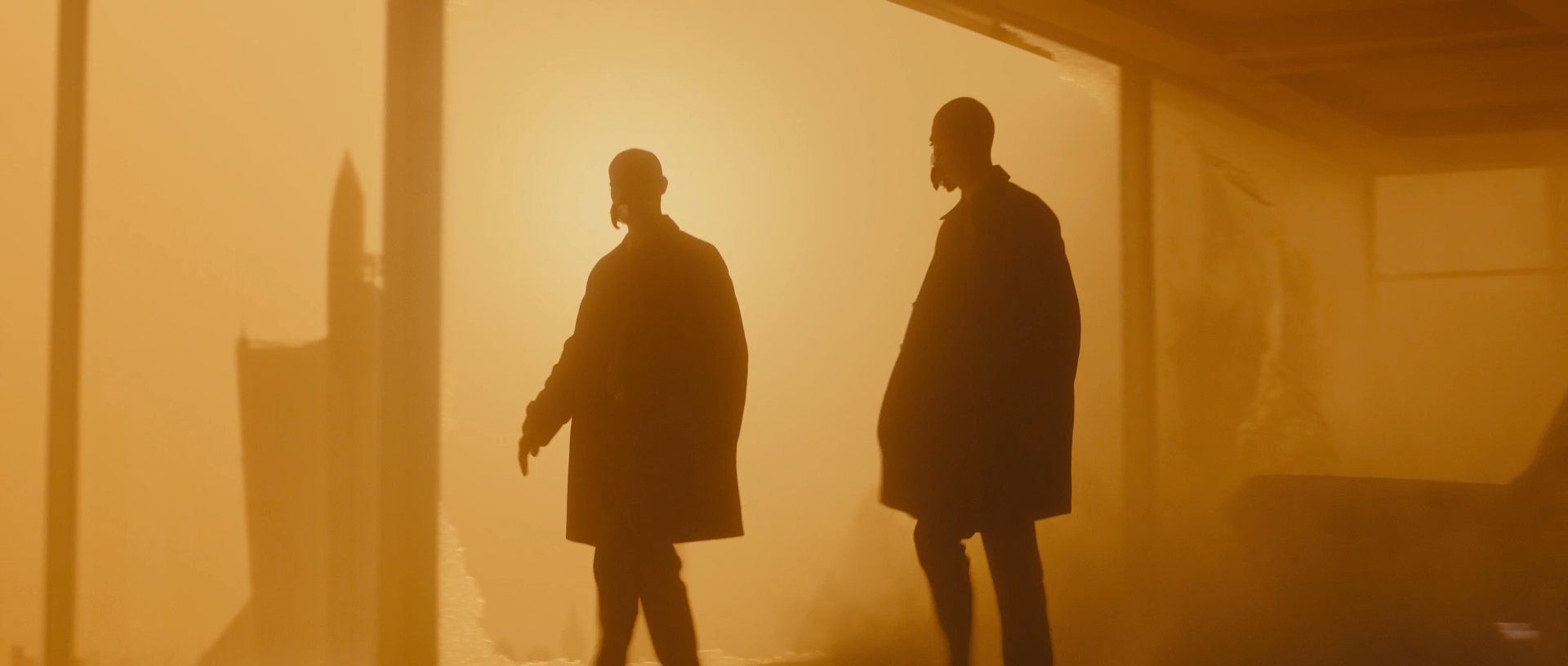
One interesting note I wanted to make: was to bring attention to the symmetry in this scene. From the get go you notice both statues are not entirely symettrucal. Officer K is not walking straight down the middle either. I came up with 2 interpretations for this.
- The framing is a reflection of this abandoned town. Things are off-kilter, displaced, unbalance etc.
- Or this is just how he chose to frame it. Maybe a restriction in crane/ studio height. symmetry in mind but details not as important?
Knowing Deakins, it most likely the former. The reason I wanted to bring attention to this scene was often at times we will look at a frame and over think the decisoins made that resulted in the frame. So it always important not to over think but to pay close attention to the details of the frame!
Silhouettes
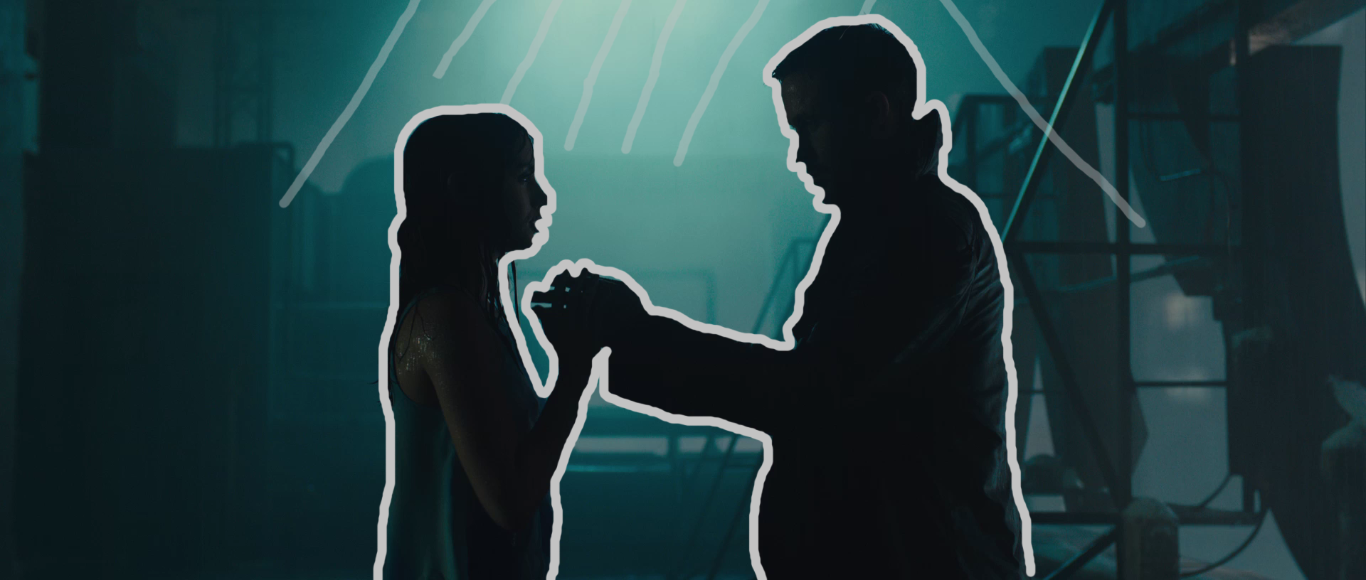
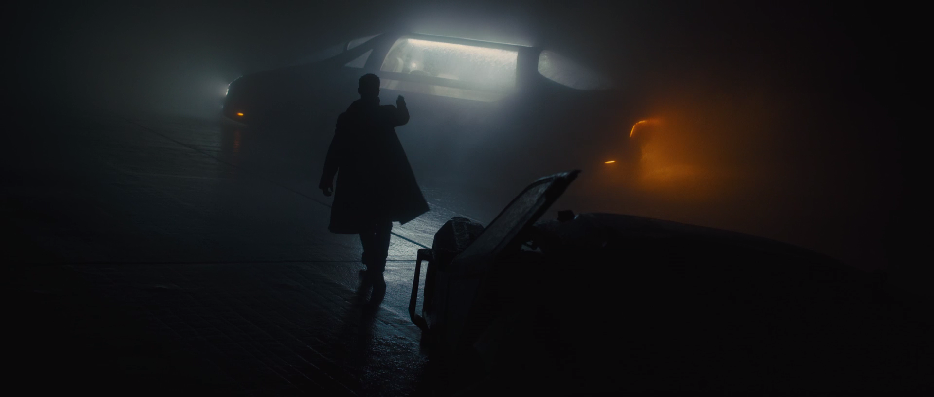
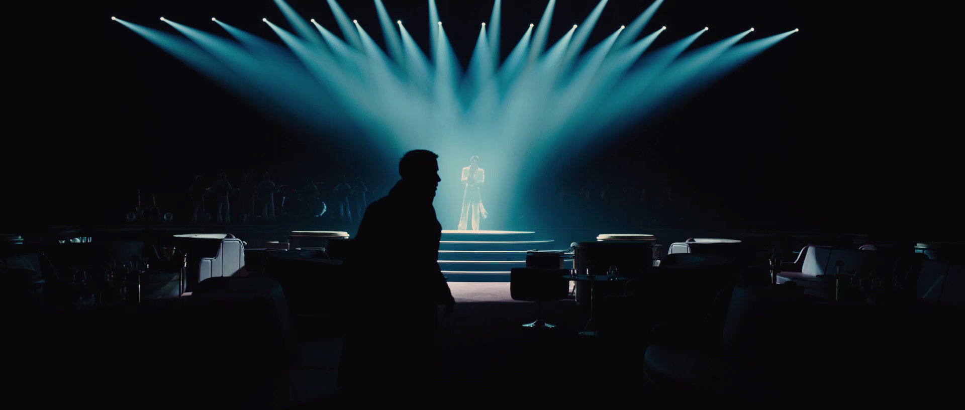
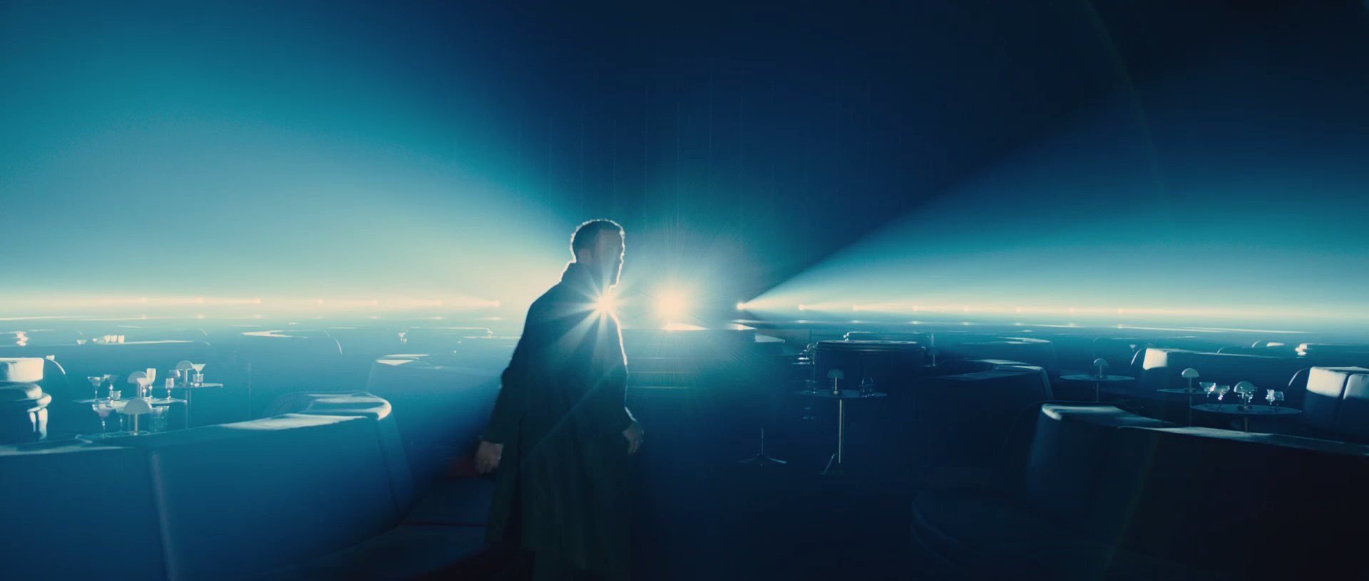
BD 2049 seems to feature a myriad of silhouettes, a favourite of both Deakins and Villeneuve. In most scenes it looks like Deakins has opted for a big and soft sources to present the silhouettes. Which in turn leads to silhouettes motivated by the environment and atmosphere. This lends to a much more "realistic" image and is aesthetically pleasing too!
Looking at Dennis Villenueve's utility belt I'm pretty sure silhouette's are front and center, and are utilised whenever deemed necessary or crucial*. In one instance I noticed a scene that was quite simillar to his past filmography. I made a mental note.
For example looking at the grab : at first glance it looks like the dam/water (not sure what it is) scene from BD 2049, but actually its from Prisoners (2013). In terms of visual motifs it's almost always used as the characters' internal perspective of the situation, rather than exclusively trying to mold what/how the audience sees the characters. Two birds one stone, but killing the bigger bird with just as small a stone that can kill the smaller bird.
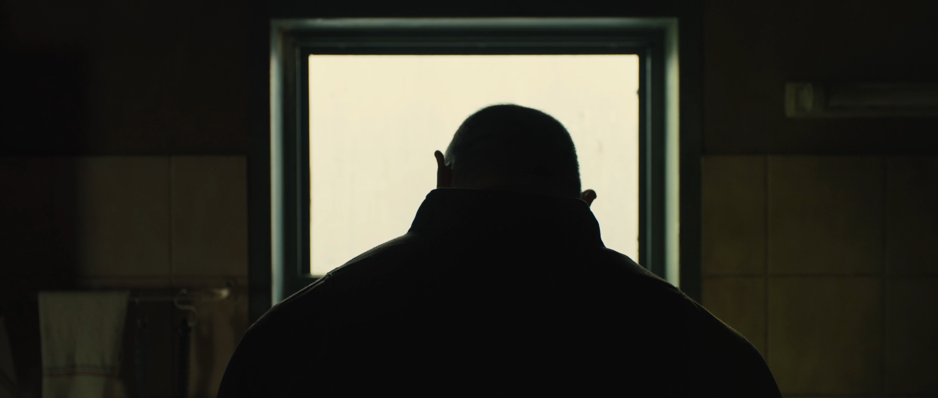
One prime example of the Villeneuve Silhouette (thats what I'm calling it, coined here first!), is executed perfectly in this scene above, lets call it the detective scene. So Officer K (Ryan Gosling) goes to this unit / house and meets Dave Bautista's Character. From what we've seen, both these characters don't know each other and or have just been introduced. The Villeneuve Silhouette does well to show that ! Both characters profiles being outlined by the source coming in from the window. Bringing in Deakins into the equation, we see the horizontal real estate of the frame being used to separate the characters with a patch of darkness in the middle. Truly simple, clever and effective. This is why I love cinematography. Its an art of the sub-consciousnesses (say it out loud, try it) and when done right it can be a powerful thing. Hmm I'm smelling a new blog post!
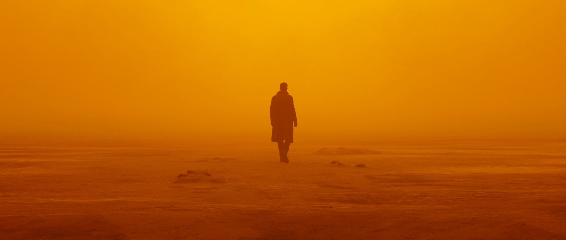
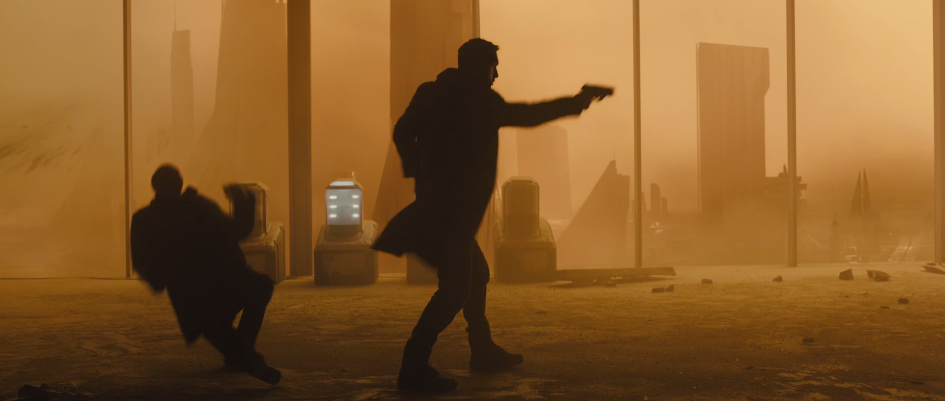
Silhouettes are not only utillised in dark scenes. In bright settings they instill the sense of wonder / mystery and danger / mystery. Above are some grabs showing the polar opposites! Including the grab below.
I cant wait for this film, in fact cant is an understatement! I hope you've enjoyed this ramble-esque piece. I manage to find some behind the scenes grabs so here they are! ( with the surprising use of DSLR to film the miniature scenes)


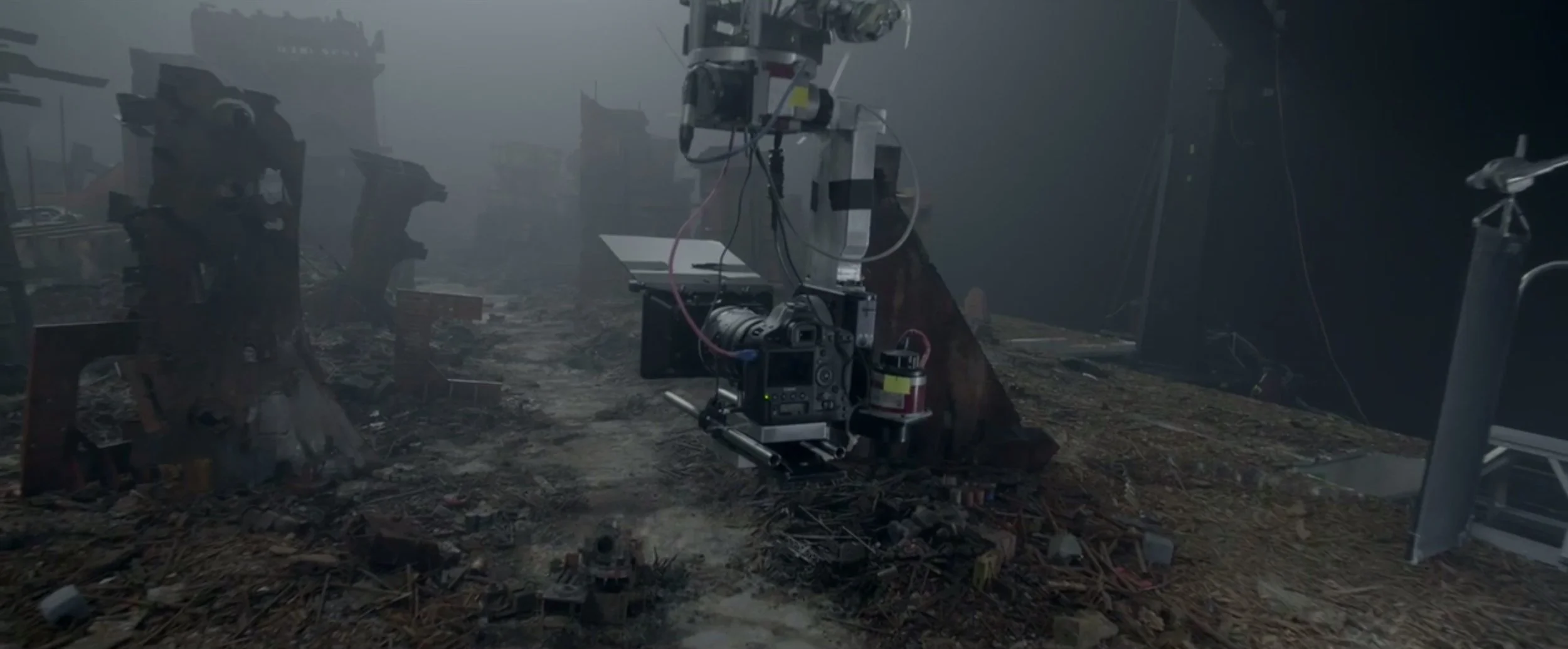

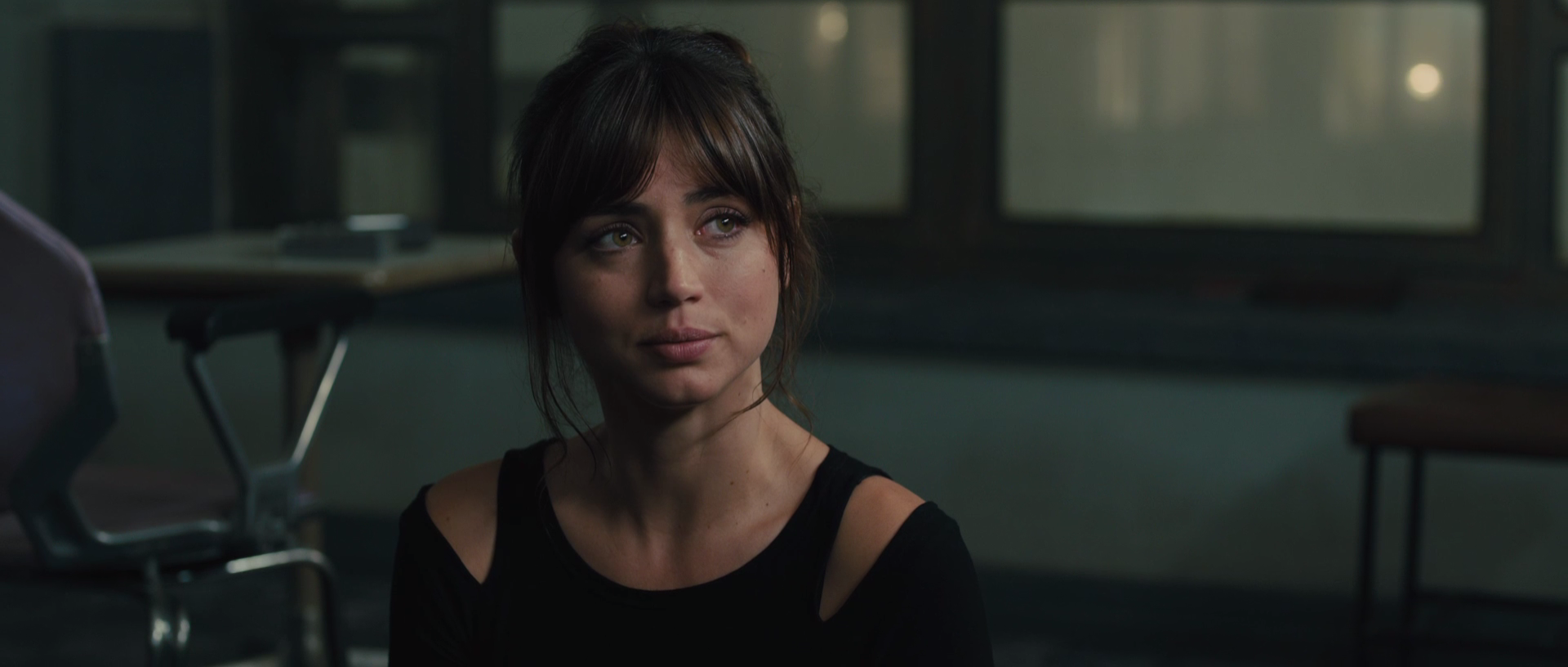
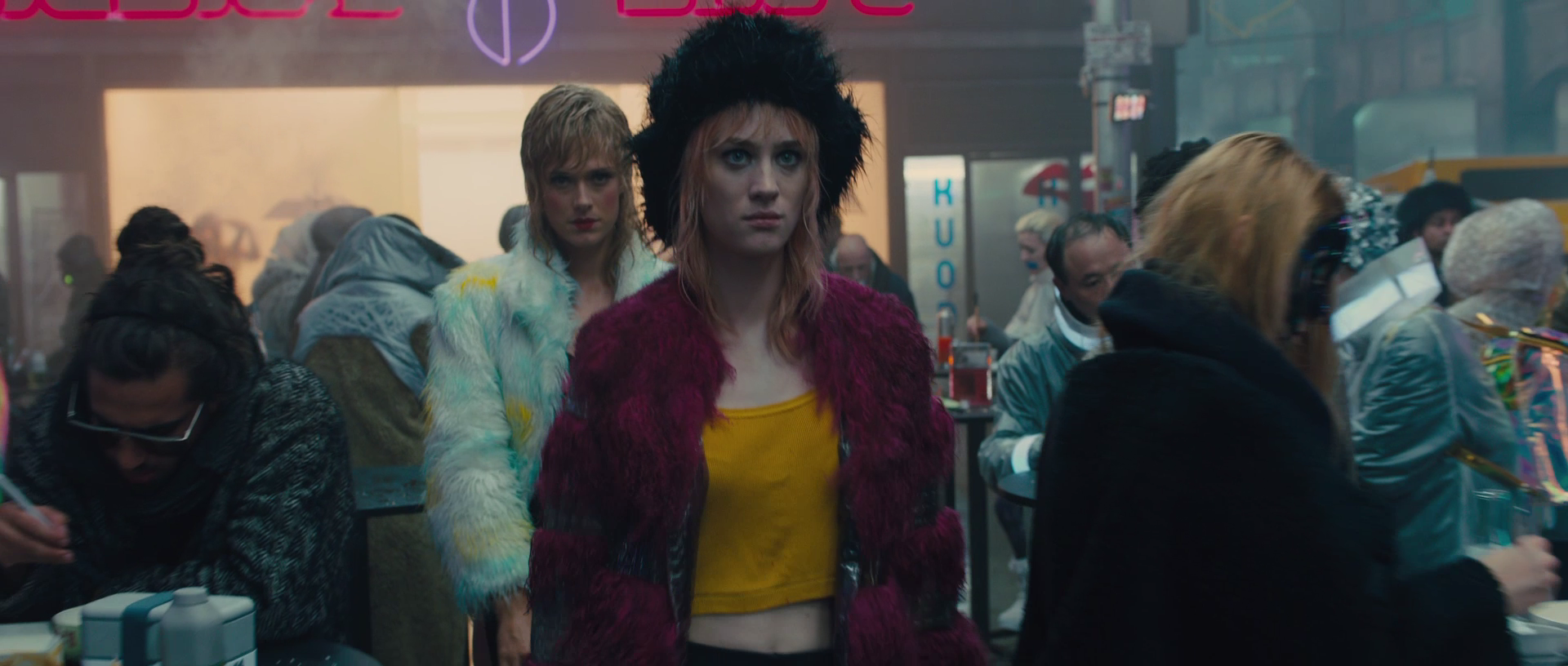
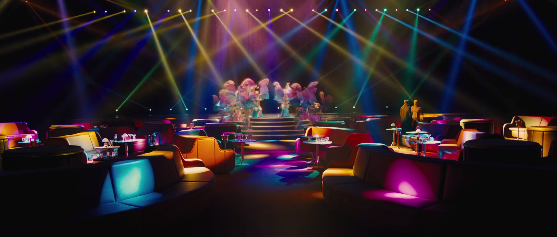
Also I thought it would be nice if I could collect all the grabs from the trailer (notable frames) and complie them. I'm more than happy to share the grabs with you guys. 60+ grabs are included in the folder all at 1920 x 800-816 (don't ask). The download link is below!

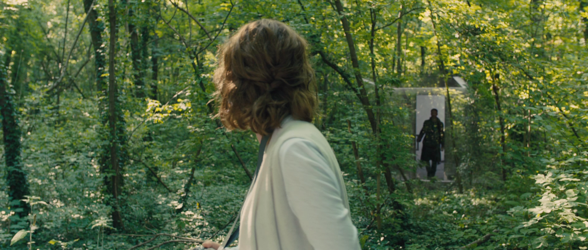


DOWNLOAD THE WHOLE SET HERE

